Best UI/UX Moments in Games That Deserve to Be Industry Standard
Some games do more than just play well – they feel right. Not because of their combat systems or story twists, but because every menu, button, and HUD element works precisely the way it should. These are the moments when great UI/UX design for games goes unnoticed – not because it’s forgettable, but because it’s seamless. It fades into the background, allowing players to engage with the world without confusion or clutter.

For casual players and fans, UI and UX are minor technical details. But ask any game designer or developer, and they’ll tell you: good interface design is everything. It shapes how people experience the game, whether it feels frustrating or fluid. The following games didn’t just get UI right – they set new standards. These examples showcase how clever interface design can elevate immersion, improve accessibility, and make mechanics more intuitive, all without breaking the player’s connection to the world.
Ghost of Tsushima: Navigation Without a Map
Tsushima’s Ghost took a bold step in the design of the open world by resuming one of the most frequent interface elements of gaming: one of the prominent markers. Instead of relying on a minimal or infiltration arrow, the game introduced the guide air – a soft, directional air that leads players to their purpose. This environmental Q replaced the traditional UI with something more elegant, allowing players to be immersed in Tsushima’s breathtaking world without constantly being interrupted by notifications at the corner of the screen.
This approach is a rare example of UI/UX becoming part of the narrative and artistic fabric of a game. The wind is more than a mechanic – it ties into the story and philosophy of the samurai. At the same time, it improves usability by gently guiding players without overwhelming them. Ghost of Tsushima proves that navigation can be both functional and beautiful – a lesson many future open-world titles would benefit from following.
Dead Space (2008): UI Without a HUD
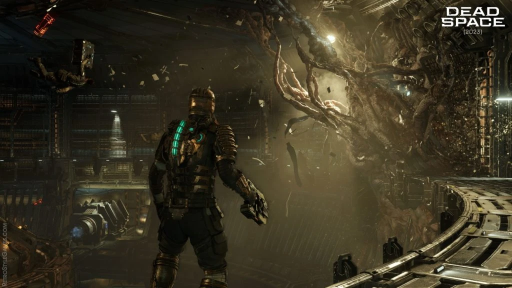
In 2008, Dead Space quietly revolutionized game interfaces by doing something bold – it removed the traditional HUD entirely. Instead of plastering health bars and ammo counters across the screen, the game integrated every essential stat into the world itself. Isaac’s health is shown as a glowing bar on the back of his suit. Ammo count floats above his weapon. Menus are projected as diegetic holograms in real-time, visible to both the player and the character.

This approach did more than just clean up the screen – it created tension and immersion like few games before it. Players weren’t pausing the action to check stats or dig through cluttered menus. Everything they needed was in the world, keeping the horror personal and unbroken. It’s a masterclass in environmental UI/UX – proving that interface elements can serve gameplay and storytelling when woven directly into the player’s surroundings.
The Last of Us Part II: Accessibility As UX
The Naughty Dog set a new standard for accessibility with The Last of Us Part II. While the game earned praise for its scenes, performances, and storytelling, it also featured one of the most expansive and most thoughtful UI/UX designs for the game’s view in recent years. It contains over 60 accessibility settings, including Text-to-Speech, High-Interest Mode, and Subtitle Customization, as well as complete remapping of control and haptic feedback cues.
What makes it a benchmark moment is not just the convenience list – it is integration. Accessibility is not an add-on here; It is embedded in the game interface, menu, and system from the beginning. Players with visual, auditory, or motor challenges are not forced to navigate limited options through confusing submenus. Everything is easy to find, easy to change, and easy to understand. This is proof that the great UI/UX not only makes the games smooth, it makes them more inclusive, and this is something that the entire industry should be for.
Hades (2020): Responsive and Stylish UX
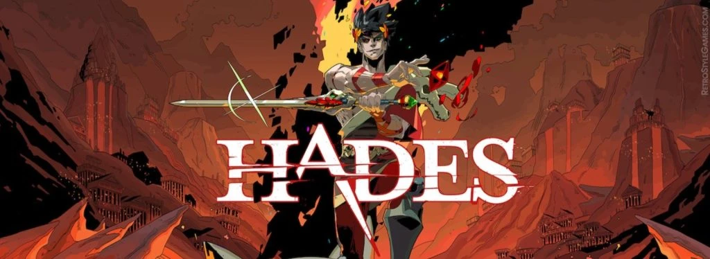
Super Zant Games’ Heads are praised for their art direction and storytelling, but their user experience is only credited as much. With several layers of mechanics that can easily confuse players, the heads manage to keep things smooth and manageable thanks to their responsible, stylish, and spontaneous UI. Whether players are choosing boons from the gods, upgrading abilities at the Mirror of Night, or navigating the House of Hades, the interface reacts instantly and presents information with perfect clarity.

What sets Hades apart is how much personality it packs into every screen. Menus are as animated and lively as the gameplay itself. Visual feedback is sharp and immediate – players always know when something’s been selected, unlocked, or upgraded. Colors and symbols reinforce learning without the need for lengthy explanations. It’s a textbook case of how UI/UX design for games can reflect a game’s tone while enhancing flow. The result is an experience that feels as good to navigate as it does to play.
Return of the Obra Dinn: UI That Feels Diegetic
Return of the Obra Dinn is a detective game with a striking monochrome art style, and its UI is just as clever as its premise. The game revolves around solving the fate of a missing ship’s crew, and all of the player’s tools – including the journal, the character sketches, and the key memory playback system – are delivered through a minimal, diegetic interface that feels like part of the game’s world. Nothing feels like a modern menu pasted over a retro setting.
Instead, the interface plays into the narrative. The journal behaves like an object that the protagonist is using. Entries update as the player makes discoveries, and clues are visually linked in ways that feel tactile and logical. Obra Dinn uses UI/UX not to simplify the mystery, but to structure it. The tools are intentionally limited, but intuitive, encouraging deduction without over-explaining. It’s a reminder that innovative UI can reinforce tone, theme, and genre – even in the most minimalist of packages.
God of War (2018): Contextual Simplicity
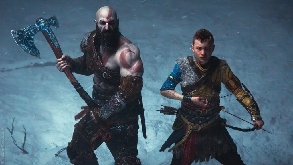
When God of War returned in 2018, it brought a new kind of Kratos – one who was more grounded and human – and the interface followed suit. Gone were the overly gamified meters and constant pop-ups of earlier titles. In their place was a clean, context-sensitive interface that responded only when needed. Health bars appear during combat. Button prompts show up when a player is near a climbable ledge or puzzle element. Outside of those moments, the screen remains free of distractions.

Menus and upgrade trees are equally polished. Despite the deep RPG system of the game, players rarely feel lost or overwhelmed. The UI is spontaneous, stylish, and easy to navigate – especially for new players. The gods of war balance the minimum design with thoughtful feedback, setting a high bar for how modern AAA titles should contact user experience. It demonstrates that a game can be rich in features without being visually noisy or mechanically dense.
Conclusion
Across genres, platforms, and visual styles, these games show just how powerful great UI and UX can be. They don’t just make things easier for the player – they elevate the entire experience. Whether it’s a glowing health bar integrated into a sci-fi suit, a gust of wind guiding your path across ancient Japan, or a set of accessibility tools that open the game up to entirely new audiences, these design decisions make a difference.
The best part? These ideas aren’t locked behind AAA budgets or massive studios. Any developer – indie or otherwise – can learn from them. Clean interfaces, responsive menus, immersive navigation, and inclusive systems are achievable with the right mindset and attention to detail. For anyone working on a game or dreaming up a project, studying these UI/UX design for games moments is one of the most innovative places to start. Not every game needs to reinvent the wheel, but the ones that do often end up defining the standard for years to come.


Comments are closed.