Anti-Advertising Secrets: How Brands Embrace “Ugly” Design
When every brand strictly follows the same polished design rules, everything starts to look exactly the same. Anti-advertising solves this by literally disrupting visual expectations. Here’s how embracing a little calculated chaos can elevate your next campaign.
Key Takeaways:
- Intentionally breaking conventional marketing rules captures immediate attention in a visually perfect feed.
- Highlighting flaws or mocking promotions uses reverse psychology to sneak past consumer defensiveness.
- Stripped-down visuals are cheaper and quicker to produce, allowing for rapid creative testing and iteration.
- Chaotic design must look entirely deliberate; otherwise, you risk appearing careless and damaging brand credibility.
The Mechanics of Anti-Advertising
Anti-advertising is a deliberate strategy to break conventional marketing rules. From its visuals, tone, and concept, this strategy provokes a reaction and a unique impression. Instead of glossy perfection, this approach leans into reverse psychology.
The concept uses a messy, unpolished layout to sell their products, highlighting flaws or openly mocking the concept of promotions itself. So, it is a sales tool that just sneaks past our mental filters.
Also Read: Designing Exhibition Stands: Brand Messaging and Visual Hierarchy
Why the Strategy Works
Throwing out the traditional marketing playbook might look reckless, but it is actually backed by solid behavioral science. It succeeds by triggering specific psychological reactions. Check out several factors that made this strategy possible.
1. Pattern Disruption
We see thousands of perfect, sterile campaigns daily, and we like them. Until a chaotic or intentionally ugly visual disrupts the pattern. It commands immediate attention because it looks completely out of place in a curated feed.
2. Lowering Defensiveness
By using self-awareness, like admitting that it is a promo, the brand can deliver a message as a joke. And nobody likes being manipulated, so the narrative bypasses psychological resistance.

3. Perceived Authenticity
Saturated with highly edited styles, raw or unstyled content may feel more like it comes from a real person than from a corporation. This strategy builds trust, particularly with an audience who values transparency and irony over polished perfection.
4. Agile Production
Stripped-down visuals are significantly cheaper and faster to produce. This allows your teams to test multiple variations rapidly without burning through massive budgets.
Pros and Cons
The Advantages: You gain higher visibility in crowded spaces, stronger brand memorability, and possibly better conversion rates because the core message takes priority over aesthetics.
The Risks: A poorly executed anti-ad can easily look incompetent rather than intentional, damaging credibility. It can also confuse your demographics when the brand is associated with high-value or premium products.
Also Read: How to Optimize Content for Search and User Experience
10 Brilliant Anti-Advertising Examples
Let’s look at how big brands run this strategy to further elevate their reach. Here are 10 examples that you can try.
1. Patagonia

In 2011, Patagonia ran a full-page newspaper spread urging people not to buy a jacket. They challenged overconsumption and brilliantly reinforced their core sustainability values by highlighting environmental costs.
2. Burger King

The 2020 “Moldy Whopper” campaign features a time-lapse of their Whopper. This deliberately repulsive visual proved that they had removed artificial preservatives, effectively flipping food photography convention on its head.
3. Heinz

Heinz asked consumers to draw ketchup from memory, resulting in messy, childlike sketches. They turned these rough drawings into billboards, highlighting the way people drew their bottles when they think of “ketchup”.
4. Liquid Death

Using death-metal typography, aesthetics, and aggressive “Murder Your Thirst” slogans, this canned water brand mocks traditional wellness tropes. Their intentionally extreme visuals perfectly contrast the calming and refreshing beverage marketing.
5. Muji

Muji built an empire on “no-brand” packaging. Their literal anti-advertising utilizes a plain cardboard look, neutral colors, and avoids flashy designs. Minding only on product quality as the selling point.
Also Read: Top 15 Best Integrated Marketing Campaigns from Major Brands
6. Dove

The “Campaign for Real Beauty” rejected glossy fashion imagery by featuring diverse, unretouched women. This simple approach successfully questioned industry standards regarding perfection and unrealistic physical expectations.
7. Ryanair

Leaning into the budget identity, Ryanair posts crudely designed memes and blunt captions mocking their own cheap flights and lack of comfort. This low-effort visual style feels highly self-aware.
8. KFC
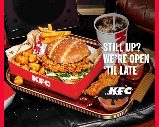
In several markets, KFC ditched styled studio photography for close-ups emphasizing greasy, highly textured chicken under awkward lighting. The raw styling made the meals look like real, attainable food.
9. Gucci

Breaking high-gloss luxury rules, Gucci released a 2024 campaign featuring grainy, skewed photos and mismatched typography. These deliberately imperfect visuals signaled irony and a sharp cultural edge to consumers.
10. Nike ISPA

Contrasting with Nike’s traditionally clean aesthetic, the ISPA line embraces chaotic product visuals. They utilize muddy colors, distorted imagery, and clashing typography that represents an improvised design.
Also Read: 5 Stages of the Digital Marketing Funnel and Its Examples
Is Anti-Advertising Your Creative Rebellion Output?
To wrap up, intentionally rejecting flawless aesthetics helps you cut through the noise and connect on a truly human level. You can tone down over-engineering your visual assets. Instead, test bold, unconventional ideas rapidly and watch how a little disruption boosts your engagement.
Even when you are ignoring the usual rules of design, your choice of type still speaks volumes. Whether your next campaign is perfectly polished or wonderfully chaotic, we offer beautifully curated typography to help your brand make exactly the right statement. Visit StringLabs Creative to enhance your design vision.