
Discovering The Types of Serif Fonts, Magnetic Fonts for Designs
The two most common typography categories, serif and sans serif have prominent differences that set them apart. In addition, you are most likely to find various types of fonts mentioned. This article covers a breakdown of types of serif fonts and how they would benefit your designs. Scroll down to find the details!
What are Sans Serif and Serif Differences?

Getting into the depth of serif fonts is a thing, but discovering what differentiates it from the sans serif helps you to better spot the distinction between the two.
The origin of serif is schreef, which comes from a word in Dutch. The word refers to the pen stroke at the end of letter characters. In the typography universe, the concept became important since it adds ornamental aspects of lettering.
Simply put, serif fonts are those fonts that have decorative elements at the beginning or end of letters and or characters. On the other hand, the sans serif describes the fonts whose letters do not have the ornamental or tailing element. Sans is a word from the French language which basically means without.
Hence, you get their most prominent difference: one has a tail or feet as a stylistic element, and the sans have a cleaner appearance without ornamental elements.
Familiarize Yourself with 4 Primary Types of Serif Fonts
The stroke and lines that come as tail, feet, or decoration to the serif font have various attributes. Based on that line, references suggest four categorizations of serif fonts.
1. Didone
What Didone usually has is a thin flare or decorative element (the serif) and horizontal lines. It is in contrast to the vertical lines, which are mostly thick and heavier. The font below, Angler, is a great example of Didone

2. Old Style
The Old style of serif font is identical to calligraphy or drawn form. No wonder the inspiration for Old Style serif font type came from the calligraphy arts from the 15th century.

Spot how the characters tend to lean diagonally, with contrasting thin and thick lines in the letterforms. What makes it actually resemble calligraphy is the rounded strokes at the end of the letters, and lowercase that are slanted. Here is a font example of Old Style Serif, namely Phoenix Ayash.

3. Transitional Serif
The third type of serif fonts in the list offers you something in between Old Style and modern Didone. They gained popularity just in the middle of the two mentioned periods of time.
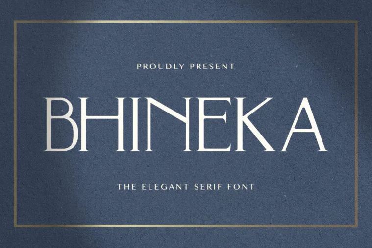
What distinguishes Transitional Serif from Old Style is the lines are more straight upright. While compared to Didone, the decorative tail or feet of the Transitional type are narrower, more like spiky ones. Look how beautiful this type of serif font example is called Bhineka.
4. Slab Serif Fonts
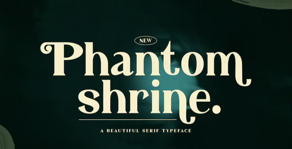
Although the difference of serif and sans serif is often highly visible, the Slab serif type might confuse you with sans serif at times. The reason is that Slab has a consistent line width. In addition, the rectangular serif makes the characters appear cleaner and minimalist.
Those attributes help Slab Serif font types a great choice for large-size utilization such as headings, posters, logos, and signage, similar to Sans Serif fonts. Here is the example, Phantom Shrine font.
Also Read: What is Blackletter Font? History, Characteristics, Recommendation
Additional Serif Font Types Terminologies
There are some other types of fonts that incorporate serifs and the types’ concepts in their designs but don’t fall into any of the primary types mentioned above. Read the following to discover them.
1. Condensed Serif
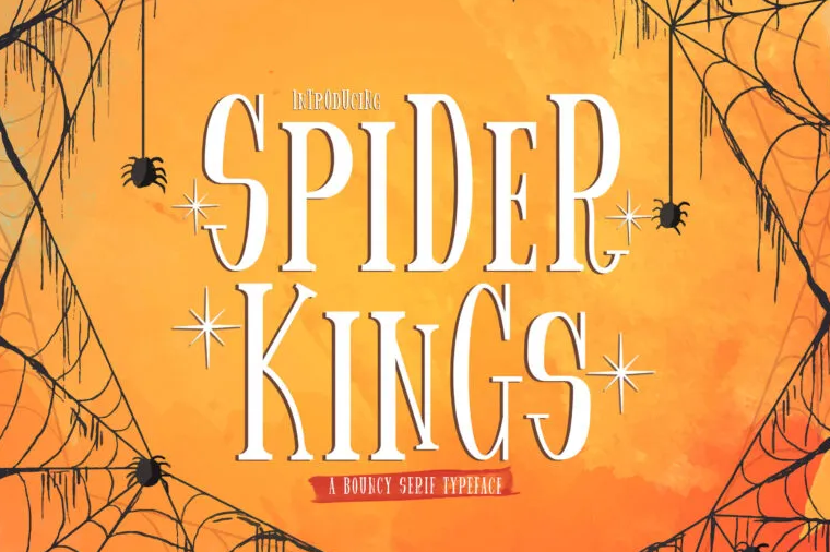
Condensed type is not dedicated only to the type of serif fonts. But, yes, the serif fonts also come with condensed letter shapes. Its most remarkable attributes are higher vertical lines with less weight. This Spider Kings font is the best representation of a condensed serif.
2. Hairline Serif
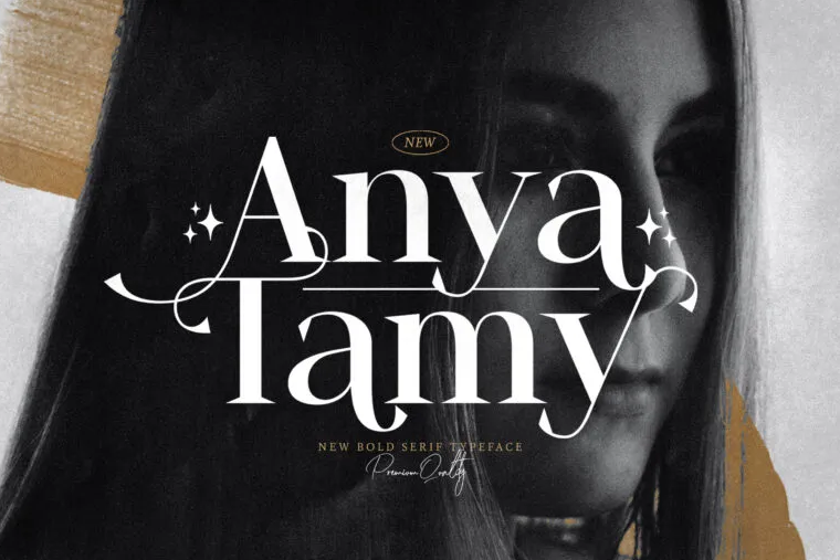
The names described the attribute of this serif type perfectly. What it refers to is the form of the ornament or serif in the characters which is really thin, just like hairlines, and not rounded. The fonts that have this serif look more modern compared to ones with bracketed decoration, just like this Anya Tamy.
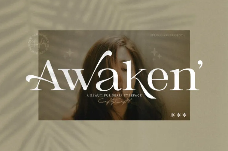
3. Wedge Serif
The fonts with wedge serif are very unconventional and tend to be more peculiar in terms of serif design and lettering forms. Accordingly, you’ll find that the feet or tail shapes are like wedges or triangles, with sharp endings. When you see Awaken font below, you’ll understand what wedge serif looks like.
How Do the Types of Serif Fonts Affect Your Designs?
Each of the serif fonts provides its own intention, mood, and tone. The choice of serif fonts you opt for will influence how the audience will perceive your brand. On the one hand, you can set up trustworthiness, reliability.
Otherwise, the serif font style you choose described elegance and versatility for your brand. From all of the above types, Slab Serif offers you a unique combination of modern appearance with stylish decorations. It appeals to the eye, yet offers engaging readability like sans serif. Get more inspiration for serif fonts on StringLabs Creative official website, and count the best deal on your choices!